
Harvey Nichols · 2017 · eCommerce & Shade Finder
Designing the Fenty Beauty launch for Harvey Nichols
Harvey Nichols was one of only a handful of UK retailers granted national exclusivity for Rihanna’s UK launch. My job was to design a shade selection experience for 40 foundation shades — and make sure the site stayed up when Sephora and Fenty’s own site didn’t.
Company
Harvey Nichols
My Role
Product Designer
Year
2017
Platform
Mobile & Desktop
£1M+
Sales in week one
Online revenue generated in the first seven days post-launch.
18%
Shade Finder add-to-bag
Of mobile users added a foundation directly after using the Shade Finder.
0
Minutes of downtime
While Fenty’s own site and Sephora temporarily went offline, ours didn’t.
01 · Context
Why this launch was different
Rihanna launched Fenty Beauty in September 2017 with one product and one radical premise: a 40-shade foundation range built on the idea that everyone deserves to find their shade. Harvey Nichols secured national UK exclusivity — which meant our digital experience was carrying significant brand weight from day one.
With Rihanna’s 100M+ global fanbase primed to shop from day one, we had two problems to solve simultaneously: design an experience that could convert a motivated but potentially unfamiliar audience across 40 foundation shades, and ensure the infrastructure wouldn’t buckle under unprecedented demand.
“I want everyone to feel included. That’s the real reason I made this line.”
— Rihanna, on the vision behind Fenty Beauty
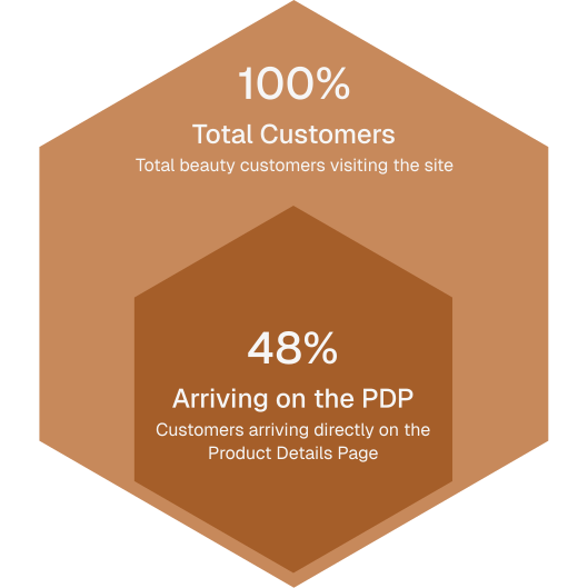
48% of beauty traffic arrived directly on the PDP. 60% were on mobile. These two numbers shaped every decision.
02 · Problem Statement
What we were actually solving
Problem Statement
Online beauty shoppers were unable to confidently identify their correct Fenty shade without in-store assistance — leading to purchase hesitation and missed conversion during a narrow, high-traffic launch window where a second chance wasn’t guaranteed.
The core UX tension was this: 40 foundation shades is an empowering range in-store. Online, without guidance, it’s paralysing. No shade finder. No undertone education. No clear hierarchy. Converting genuine curiosity into a confident purchase decision required building that guidance from scratch.
03 · Discovery
Understanding before solving
With a fixed launch date and strong creative direction from the Fenty brand team, discovery had to be fast and focused. We combined analytics, competitor benchmarking, and guerrilla usability testing to validate assumptions before committing to a design direction.
Step One
Analytics — understanding where users were and what they were doing
Working with the analytics team, we mapped the existing beauty funnel. The 48% direct PDP landing rate was the first surprise. The second was that 60% of all beauty traffic was mobile — which meant any solution had to be exceptional on small screens first.
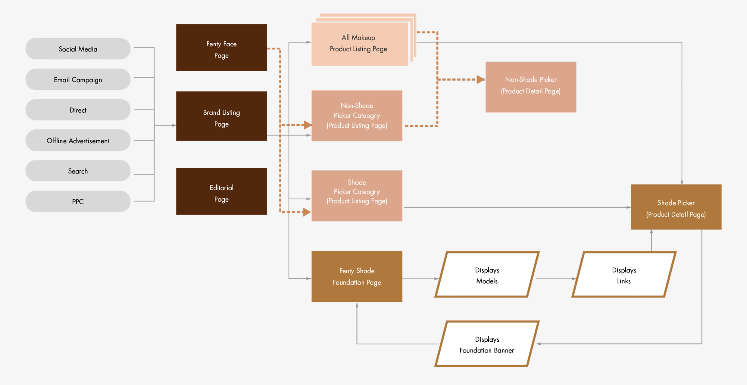
Step Two
Competitor benchmarking — learning from how other retailers handled large shade ranges
We audited how other beauty retailers managed 20+ shade ranges online. Accordion-style grouping by shade family emerged as the dominant, most navigable pattern. Carousels without visible scroll affordance consistently performed poorly — a finding that would prove critical later.
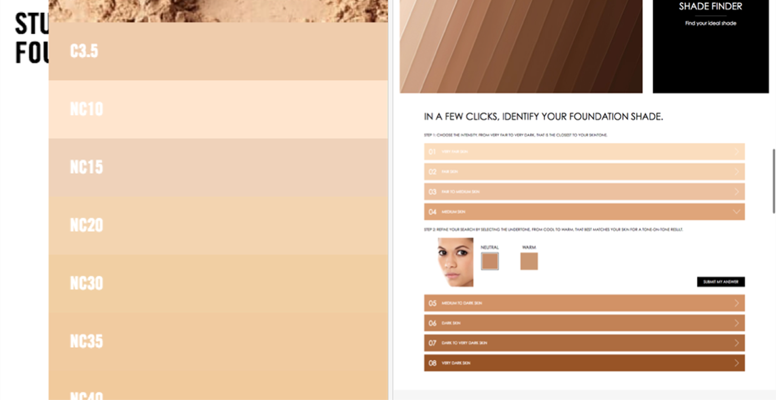
Step Three
Guerrilla testing — six participants, mobile-first, focused on shade navigation
We ran rapid usability sessions with six participants, testing on mobile first given the traffic data. The sessions focused on three things: how people navigated across shade categories, whether they understood undertones, and whether they could tell the carousel was scrollable.
60%
Navigated successfully
Used the accordion pattern without difficulty
40%
Identified carousel as pain
No visible scroll affordance — missed shades entirely
0/6
Knew their undertone
No participant could define warm, cool, or neutral without prompting
What the research told us
Undertone was the biggest knowledge gap
Zero participants knew their undertone unprompted. Education had to be built into the journey — not relegated to optional content.
Mobile flow was intuitive when it worked
When the carousel problem was absent, mobile participants found the experience fluid and fast — validating the mobile-first approach.
The carousel had no scroll signal
40% of testers missed shades entirely. No partial tile visibility, no indicator that more options existed beyond the visible set.
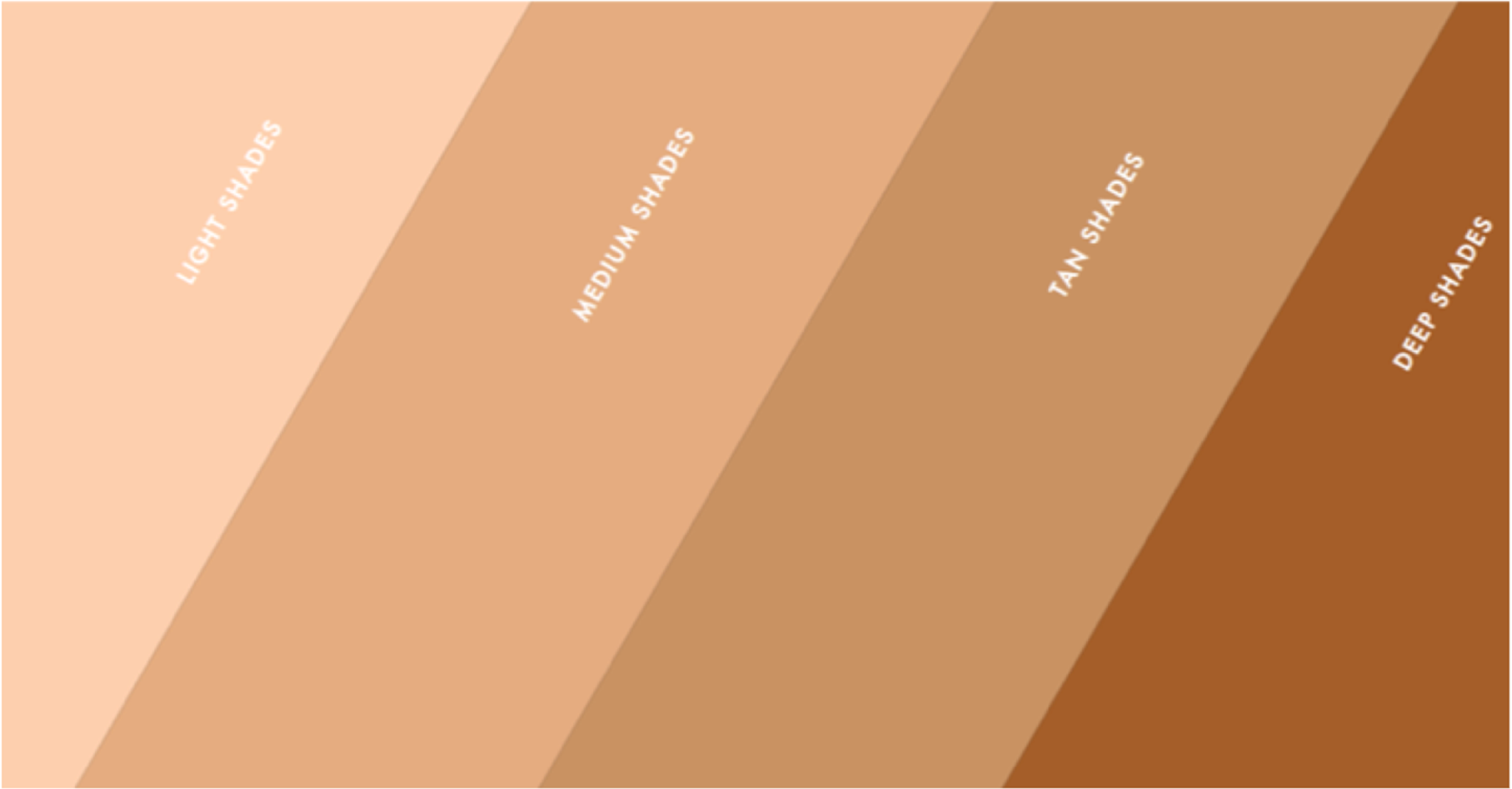
Shade categories needed visual anchors up front
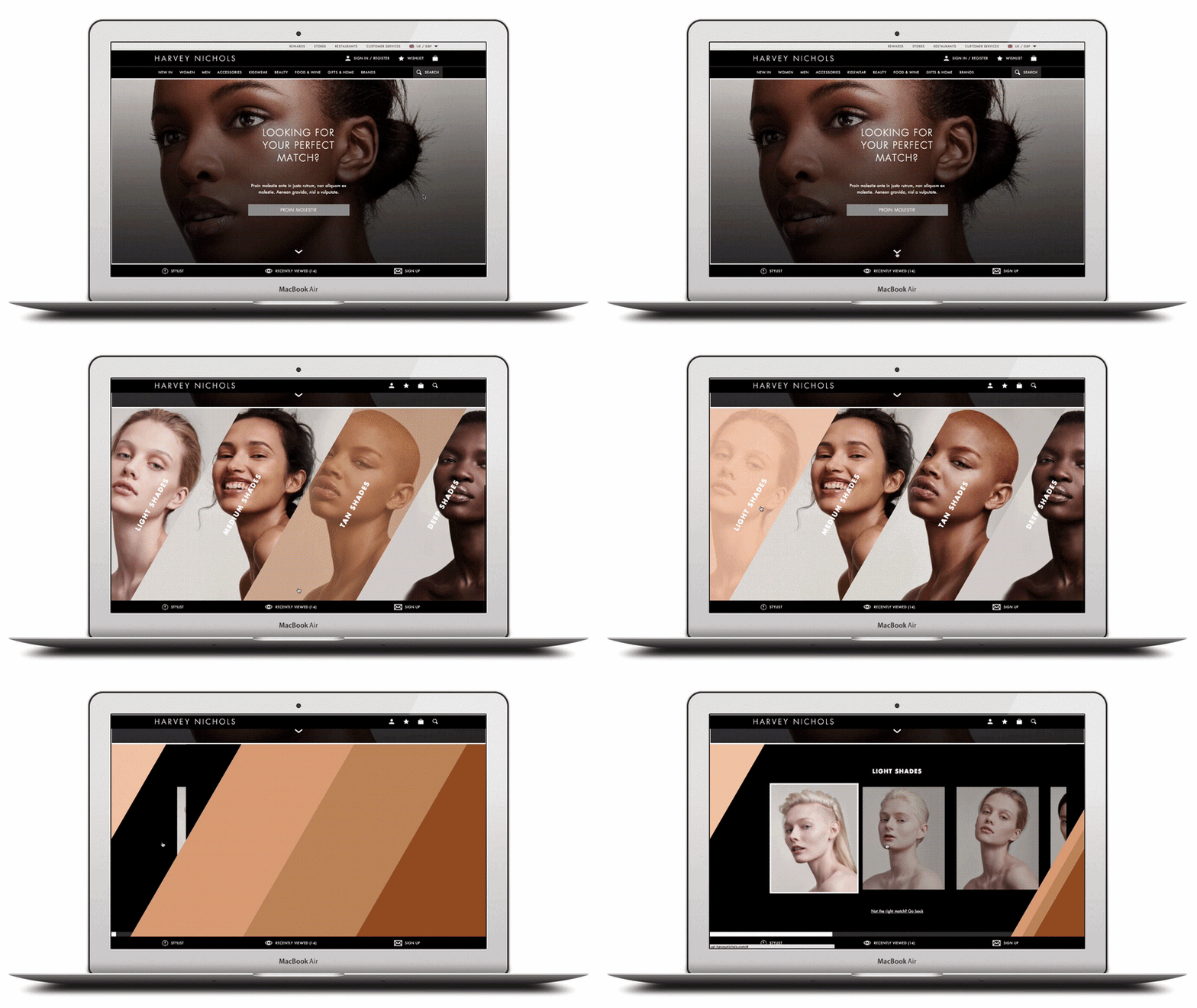
Labels like “light” or “deep” alone were insufficient. Users needed a visual example before they could confidently self-identify and proceed into a shade family.
04 · Design Process
From insight to shipped experience
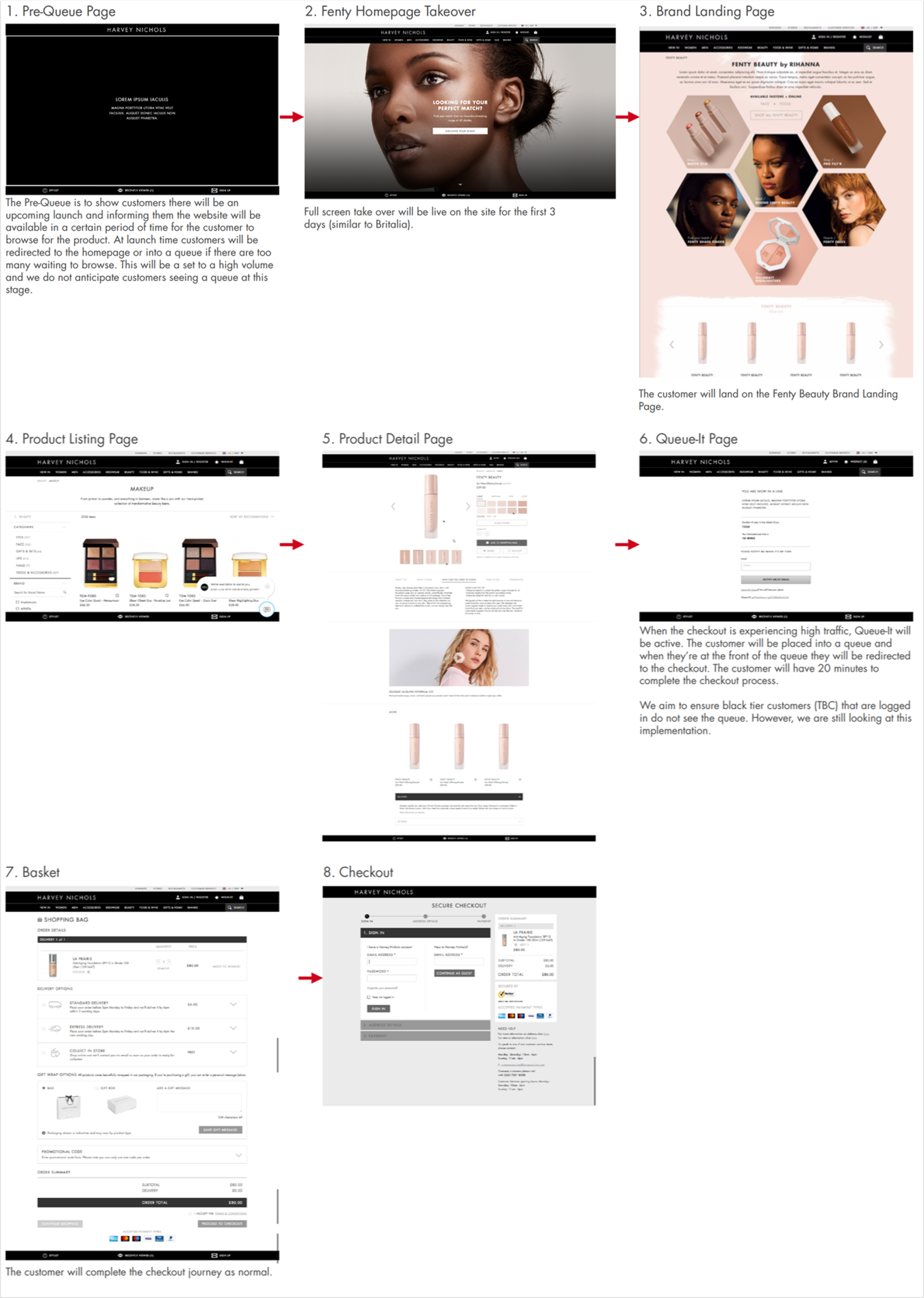
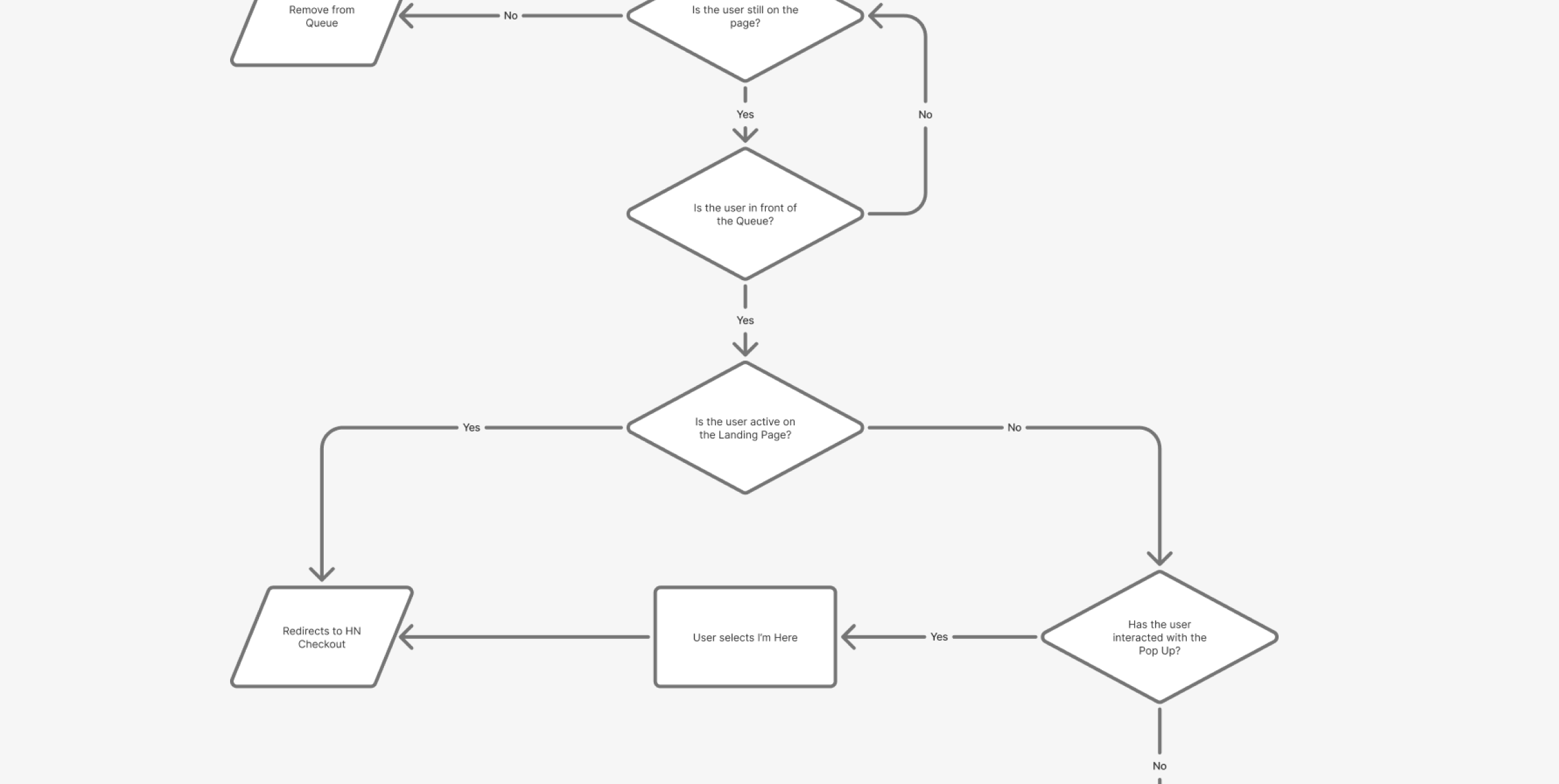
The design ran on two parallel tracks: the customer-facing Shade Finder and PDP experience, and the Queue-It traffic management flow for launch day. Both had to work flawlessly on the same day.
The four decisions that shaped the final experience
Decision 01
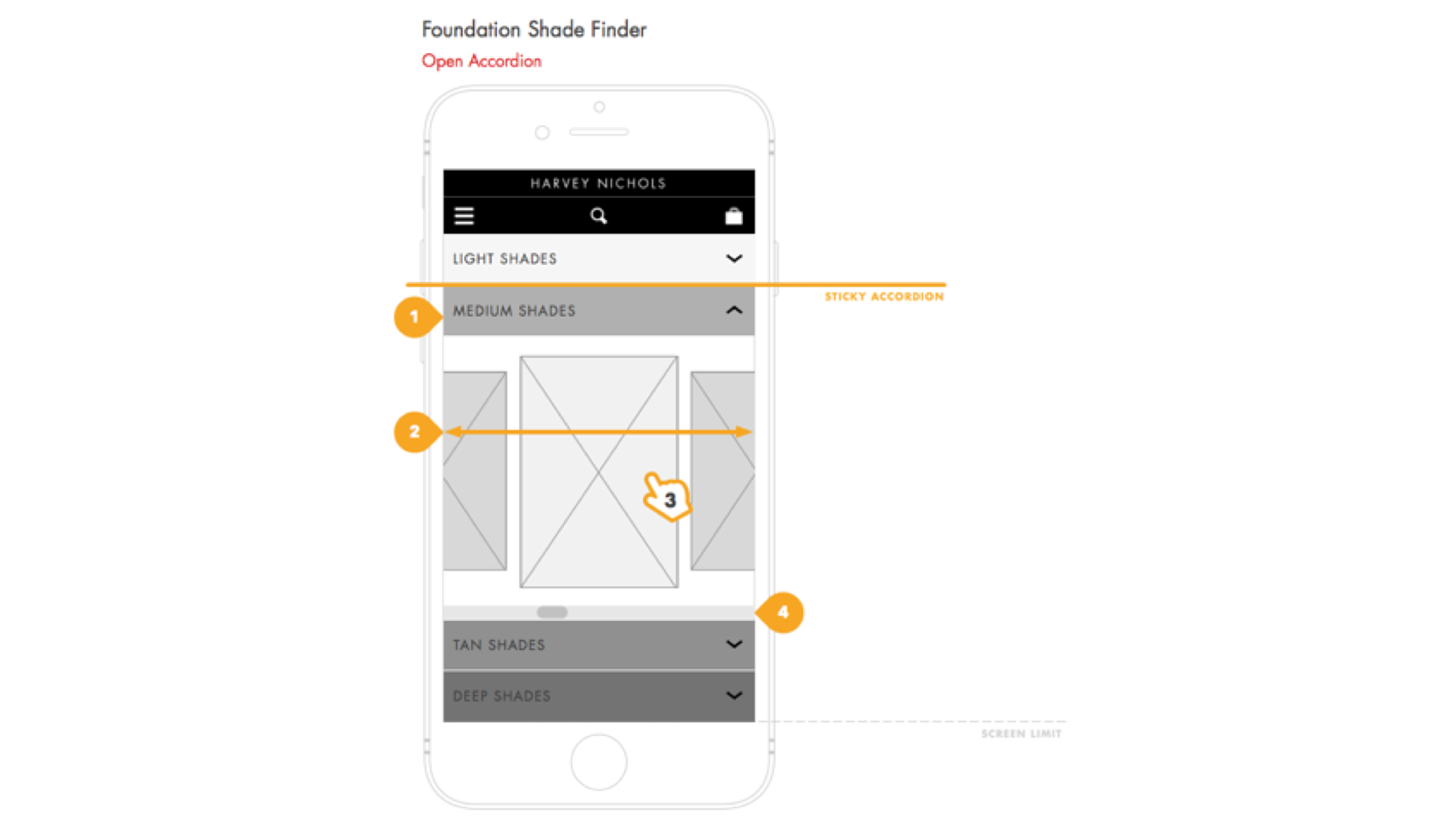
Accordion grouping over flat listing for 40 shades
Rather than presenting all 40 shades in a flat grid — which overwhelmed test participants — we grouped by shade family with visual anchor swatches at the category level. Users could self-identify a broad range before drilling into specific options, reducing cognitive load without hiding choice.
Decision 02
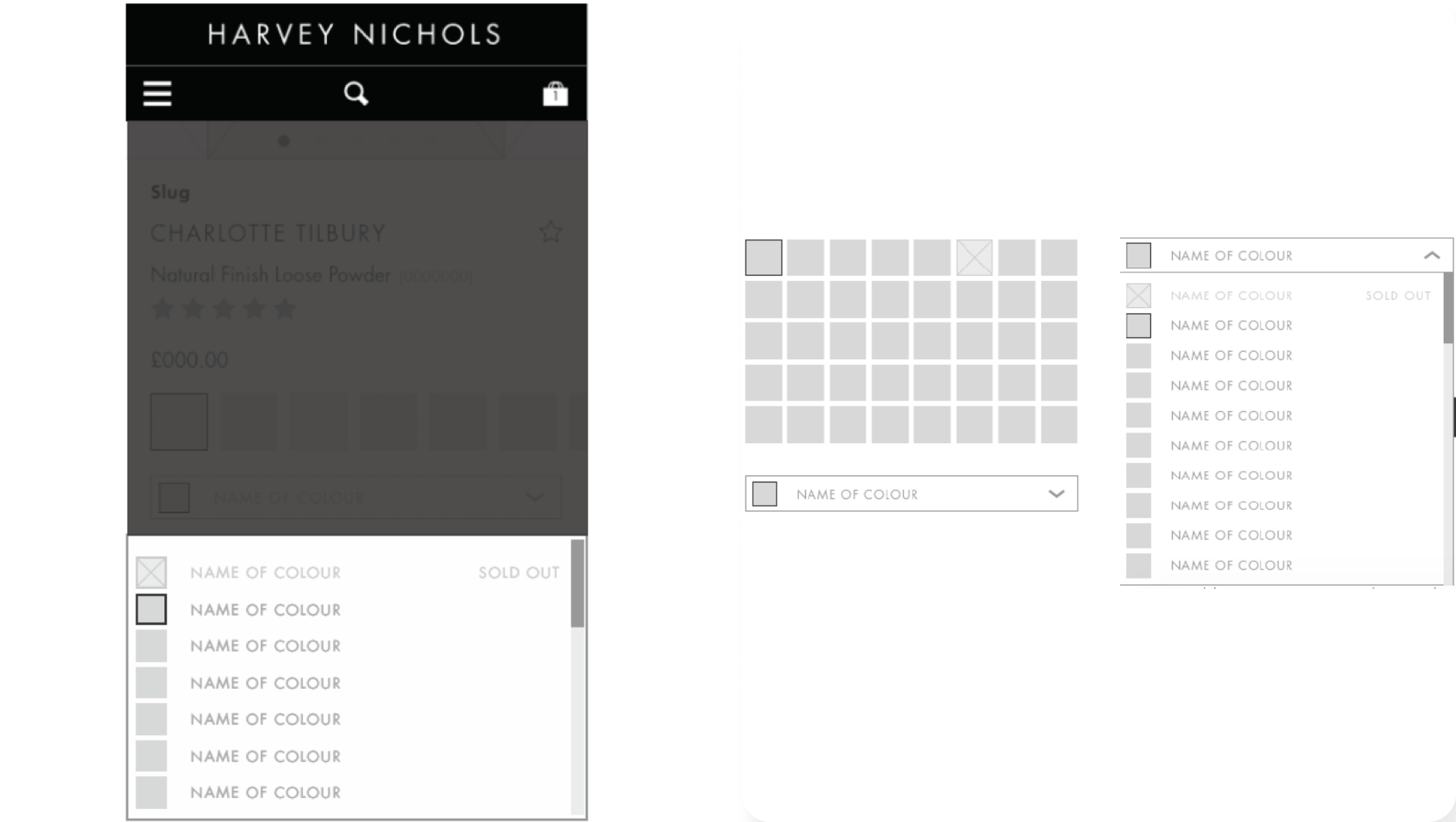
Swatch + dropdown combined on PDP to eliminate ambiguity
We paired swatch selection with a persistent dropdown label so users always had text confirmation of their chosen shade alongside the visual. On mobile, where swatch tap targets are small and misselection is common, this was a critical error-prevention pattern.
Decision 03
Undertone education built directly into the Shade Finder flow
Rather than treating undertone knowledge as something users should arrive with, we embedded concise educational content into the Shade Finder journey itself — explaining warm, cool, and neutral undertones with visual examples before asking users to self-identify. The tool was genuinely useful to a first-time buyer, not just a shortcut for someone who already knew what they wanted.

Decision 04
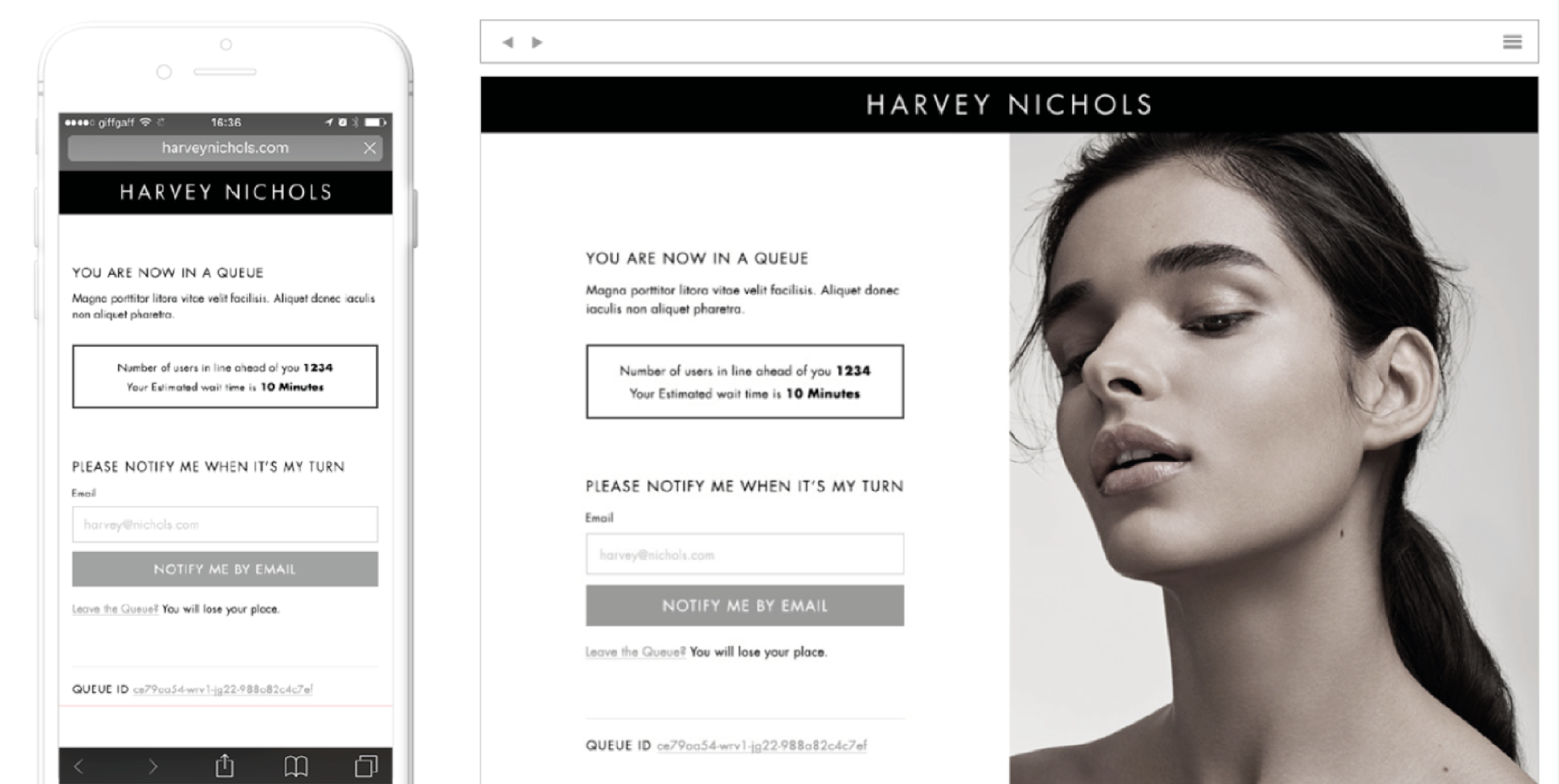
Queue-It re-entry flow designed to preserve purchase intent
The virtual waiting room was necessary for launch day — but a poorly designed re-entry experience could destroy the conversion momentum built up before a user entered the queue. Working closely with the PM, Head of Technology, and Queue-It’s own team, I mapped the full end-to-end journey. Re-entry always returned users to context — never a blank homepage.
Final designs
05 · Outcomes
What actually happened on launch day
The hypothesis held. The Shade Finder drove meaningful conversion on mobile, the site remained fully operational while competitors crashed, and Fenty Beauty became one of Harvey Nichols’ most commercially successful online launches.
£1M+
Revenue in week one
Harvey Nichols generated over £1 million in Fenty Beauty online sales within the first week — a benchmark for digital beauty launches at the time.
18%
Shade Finder add-to-bag
18% of mobile users who used the Shade Finder added a foundation directly to their bag — strong validation that guided shade discovery converts intent into action.
0
Minutes of downtime
While Fenty Beauty’s site and Sephora experienced outages, Harvey Nichols remained fully operational — releasing 1,000 users every 20 minutes via Queue-It.
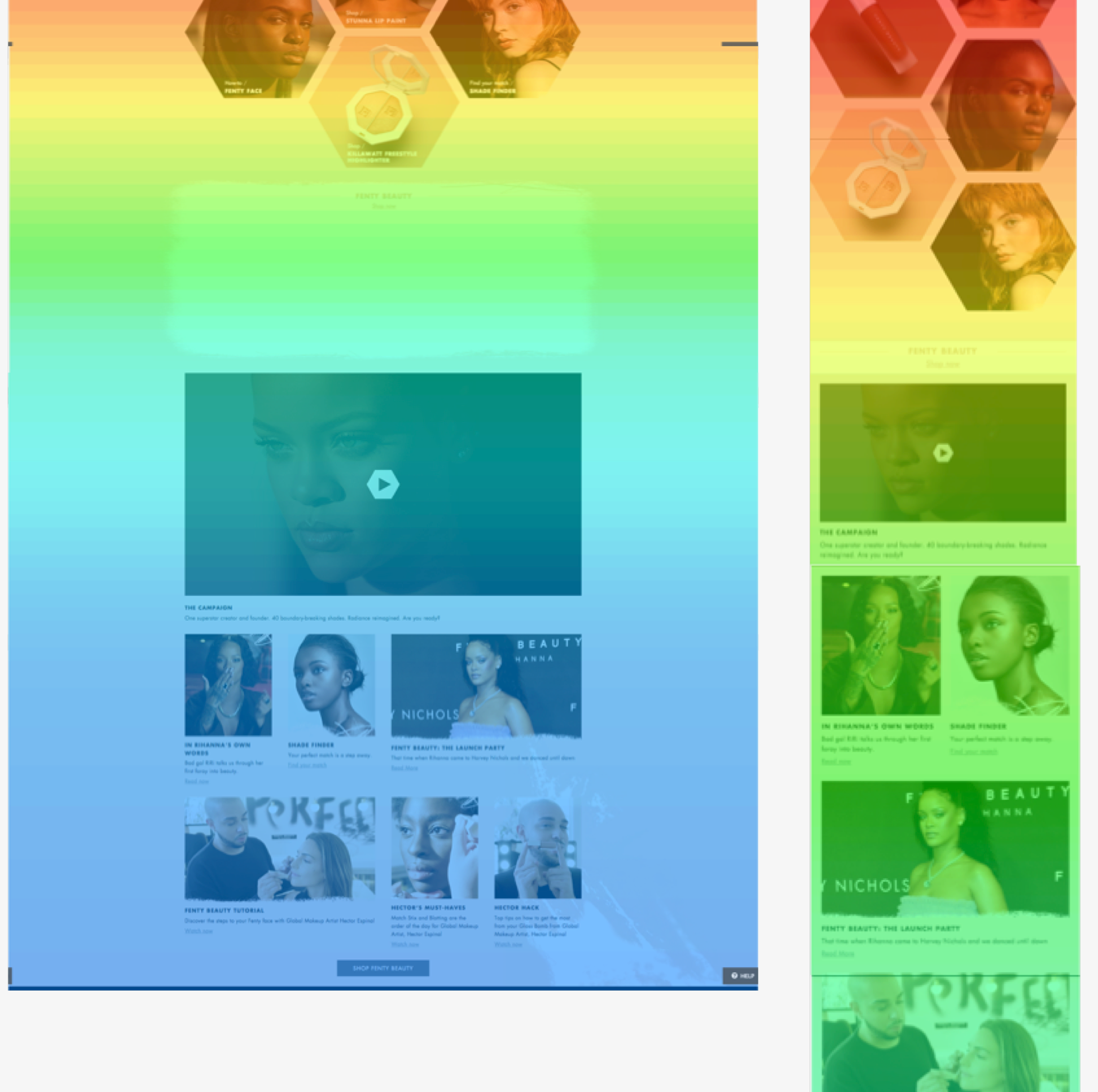
A post-launch UX review also surfaced optimisation opportunities for the next iteration: improving carousel scroll affordance on desktop, refining promotional placement to reduce distraction on the PDP, and enhancing mobile navigation to increase product discovery beyond the Shade Finder entry point.
06 · Reflections
What I’d take forward
01
Constraints sharpen design thinking
A fixed launch date, a powerful brand with strong creative opinions, and infrastructure under serious pressure forced clarity at every stage. There was no room for “we’ll figure it out later” — every decision had to be made, validated, and committed to. I’d replicate that level of rigour on any project, not just high-stakes ones.
02
The carousel issue should have been caught earlier
The scroll affordance problem identified in guerrilla testing wasn’t fully resolved before launch — post-launch review confirmed it was still causing friction on desktop. Earlier testing with the built component, rather than the prototype, would have caught this. Testing fidelity needs to match the questions you’re actually asking.
03
Inclusive design is a product strategy, not a nice-to-have
Rihanna’s vision — that everyone deserves to find their shade — wasn’t a marketing line. It was the product brief. Building undertone education into the Shade Finder, rather than treating it as optional supplementary content, was the right call. The conversion data backed it up. Inclusive design that meets users where they are generates better outcomes for the business too.
04
What a second iteration would explore
Personalisation is the logical next step — returning users who’ve already found their shade shouldn’t start from scratch. A saved shade profile, matched recommendations, and proactive restock alerts would extend the relationship well beyond the initial launch moment. That kind of long-term thinking is where the real product value lives.
Next // Selected Works
THE OUTNET – iOS Refresh
Get In Touch
Let’s build something great together.
Whether you’re looking for a Senior Product Designer for your next big project or want to talk through a challenge — I’m always happy to have a conversation.