
THE OUTNET · YOOX NAP Group · iOS · 3-Month Sprint
THE OUTNET – iOS Refresh
Four years since the last major update. 89 usability issues prioritised. Two personas. Three months. I led the iOS Refresh — conducting a full UX audit, redesigning navigation, and validating improvements with Firebase A/B tests that delivered +67% filter usage and +104% sort usage.
Company
THE OUTNET (YOOX Net-A-Porter)
My Role
Mid Product Designer – Design Lead
Timeline
3-month sprint
Platform
iOS · Android alignment
+67%
Filter usage per session
Firebase A/B test, PLP — validated navigation restructuring decision.
+104%
Sort usage per session
Firebase A/B test, PLP — sort usage more than doubled post-redesign.
89
Usability issues prioritised
Severity and impact model using Baymard’s guidelines — clear roadmap for the team.
01 · Context
Four years of accumulated debt. Three months to fix it.
THE OUTNET — the luxury off-price fashion platform from YOOX NAP — hadn’t had a major app update in four years. With a newly formed Product Design Team and a new strategic head on web, there was both an opportunity and an urgency: align app and web into a consistent omnichannel experience while addressing structural navigation and usability issues that had compounded over time.
I led the iOS Refresh — conducting a full UX audit, running empathy mapping workshops, designing navigation and PDP improvements, and running A/B tests via Firebase to validate the highest-impact changes before full rollout.
Problem Statement
iOS users across both customer segments struggled to find products efficiently due to fragmented navigation, inaccessible Search and Wishlist, and inconsistent patterns between iOS and Android — resulting in missed product discovery, lower conversion, and an experience below the brand’s luxury positioning.
02 · Understanding Our Users
Two very different customers. One app.
Working with the Marketing Insights team, we identified two primary personas — each with distinct motivations, shopping behaviours, and expectations. Understanding both was essential: the same navigation change that delighted a Style Striver could frustrate an Established Affluent.

Established Affluents
High-income, fashion-savvy. Expect effortless luxury comparable to flagship retail. Browse frequently for new-in arrivals. Sensitive to friction in the premium browsing experience. Desire to feel exclusive and “in the know.”

Style Strivers
Younger, trend-driven. Actively seek discounts and deals. Browse frequently for inspiration and discovery. May feel overwhelmed by unclear navigation. Excited by finding great designer value — and the social credibility it brings.
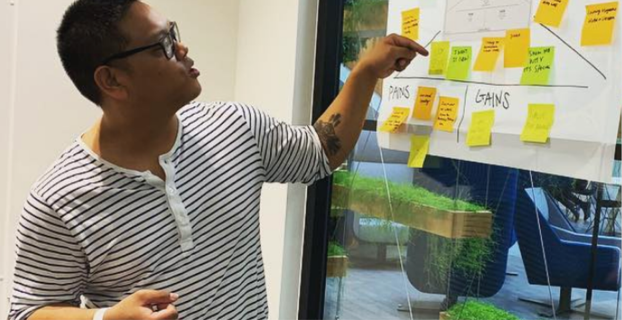
An empathy mapping workshop with the Product Design team aligned everyone on the distinct needs of both personas before any design decisions were made.
03 · Hypothesis
Navigation is the conversion lever
Before the audit findings were even fully synthesised, the data was already pointing in one direction. We aligned the team on a shared hypothesis that would anchor every subsequent design decision — and give us a clear measure of success when it came to A/B testing.
We believe that
Restructuring the bottom navigation, improving filter and sort accessibility on PLP, and introducing a sticky Add to Bag on PDP
For
Both Established Affluents seeking effortless premium browsing and Style Strivers seeking discovery and deals — across a platform where 60% of traffic was mobile
Will result in
Higher filter and sort engagement on PLP, more efficient product discovery, and improved conversion on key purchase actions on PDP
We’ll know when
Firebase A/B tests show statistically meaningful uplift in filter and sort usage per unique session — and the sticky Add to Bag test shows measurable improvement in add-to-bag rate on PDP
It’s worth noting the second half of the hypothesis — the sticky Add to Bag — was included precisely because we weren’t certain it would work. Testing it honestly was more valuable than assuming the answer. That turned out to be the right instinct.
04 · Discovery
89 issues. Two personas. One audit.
Step One
Analytics — identifying where users were struggling
Working with the Analytics team in Bologna, we identified key navigation behaviours: strong interest in “Just In” but signs of confusion — users repeatedly clicking it or returning to Categories after failing to find products. Low engagement with Search and Shopping Bag despite their importance to conversion.
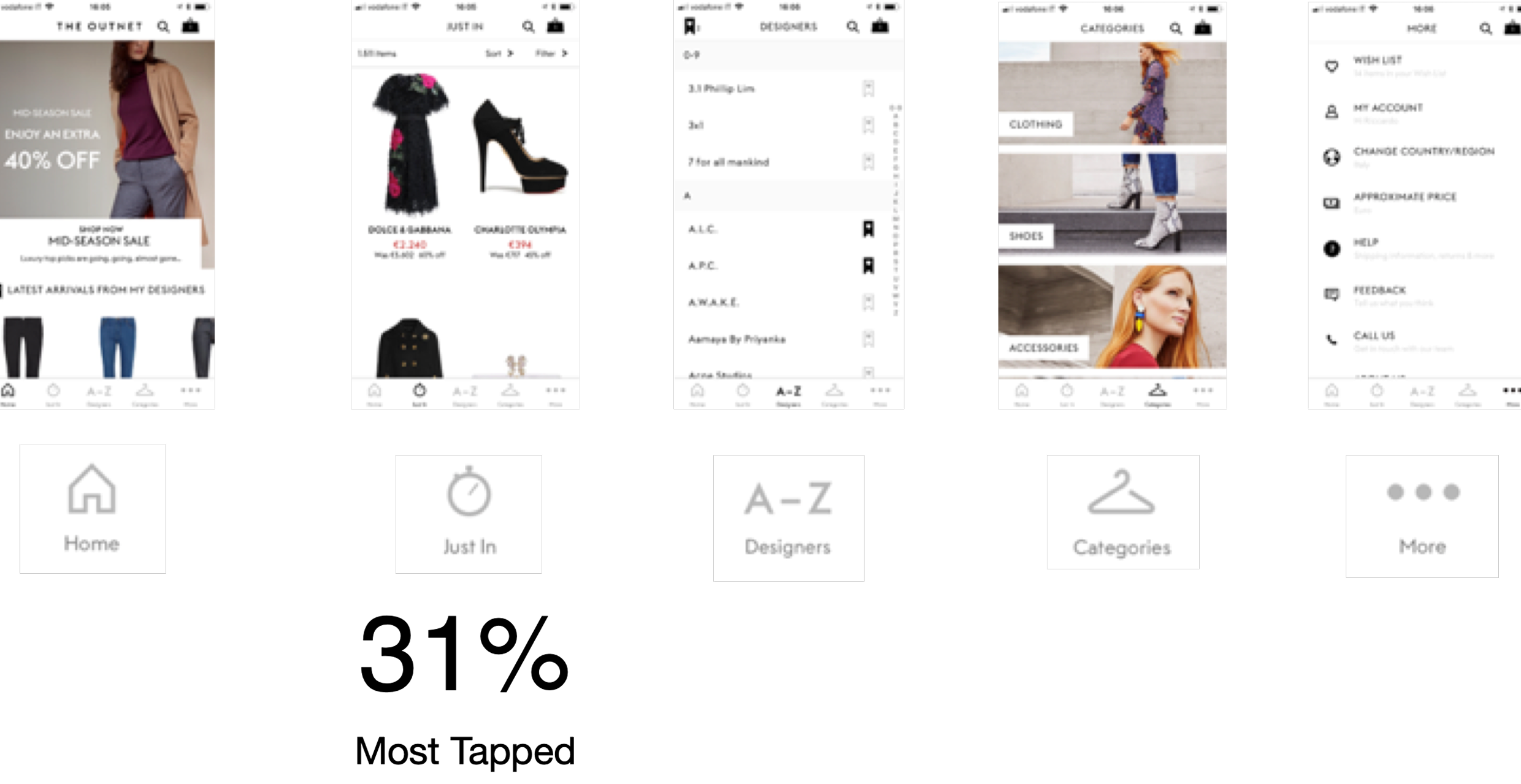
Data from Bologna confirmed the pattern: users knew what they wanted, but couldn’t find it through the existing navigation structure.
Step Two
UX Audit — 89 issues, prioritised by severity and impact
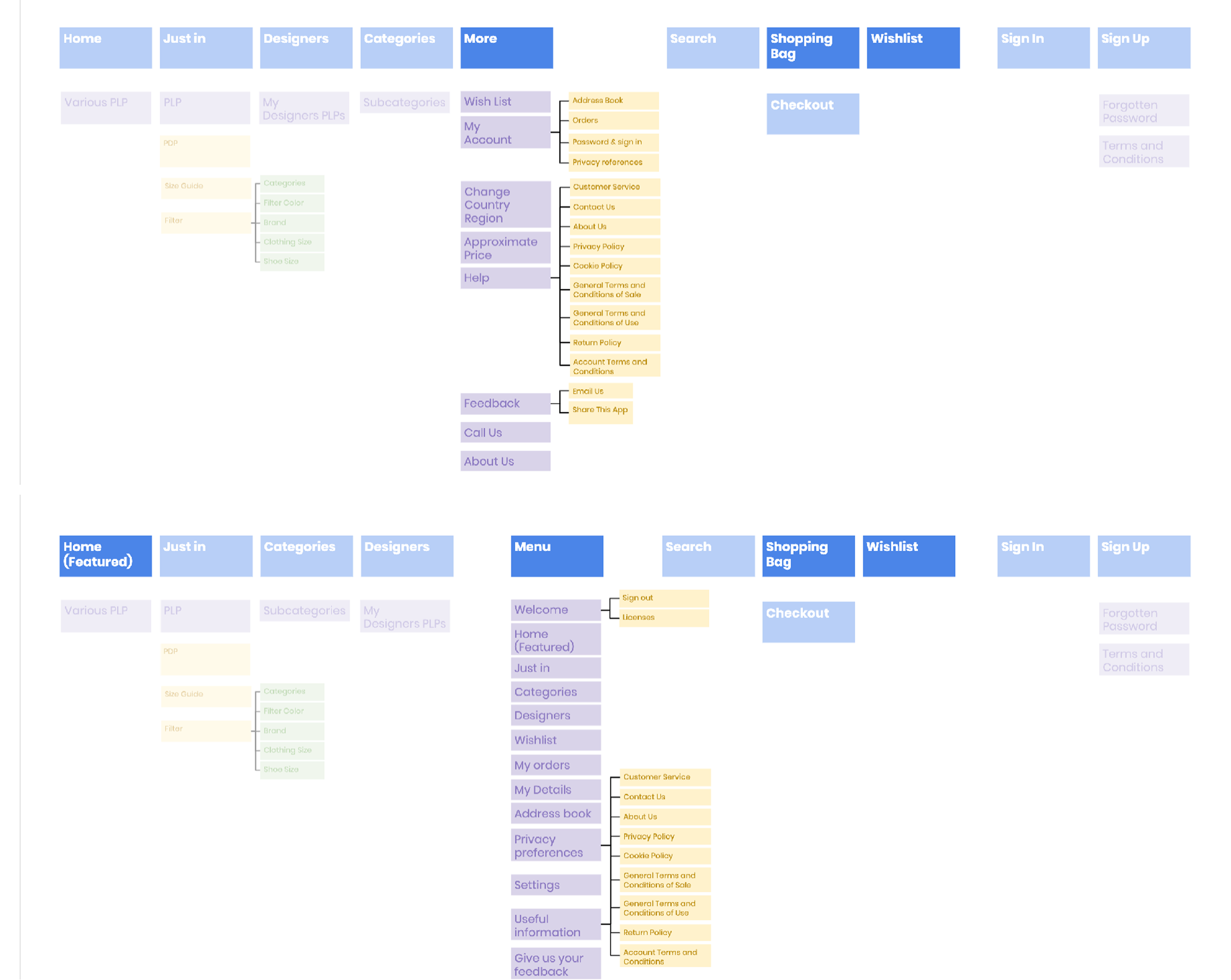
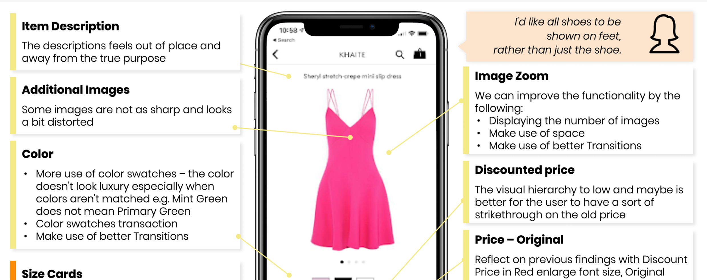
I conducted a full heuristic evaluation combined with a content and functionality inventory across iOS and Android. Using Baymard’s severity and impact model, I prioritised 89 usability issues — producing a structured backlog that Engineering, QA, and Product could all work from. This transformed a vague “improve the app” brief into a clear, evidence-based roadmap.
Step Three
Internal usability testing — validating design solutions before development
I created an interactive prototype focused on the PLP→PDP journey and ran structured testing sessions with clearly assigned team roles. Testing revealed confusion around filter feedback, sort confirmation, touch targets, and low-stock notifications. These insights shaped the next iteration directly.
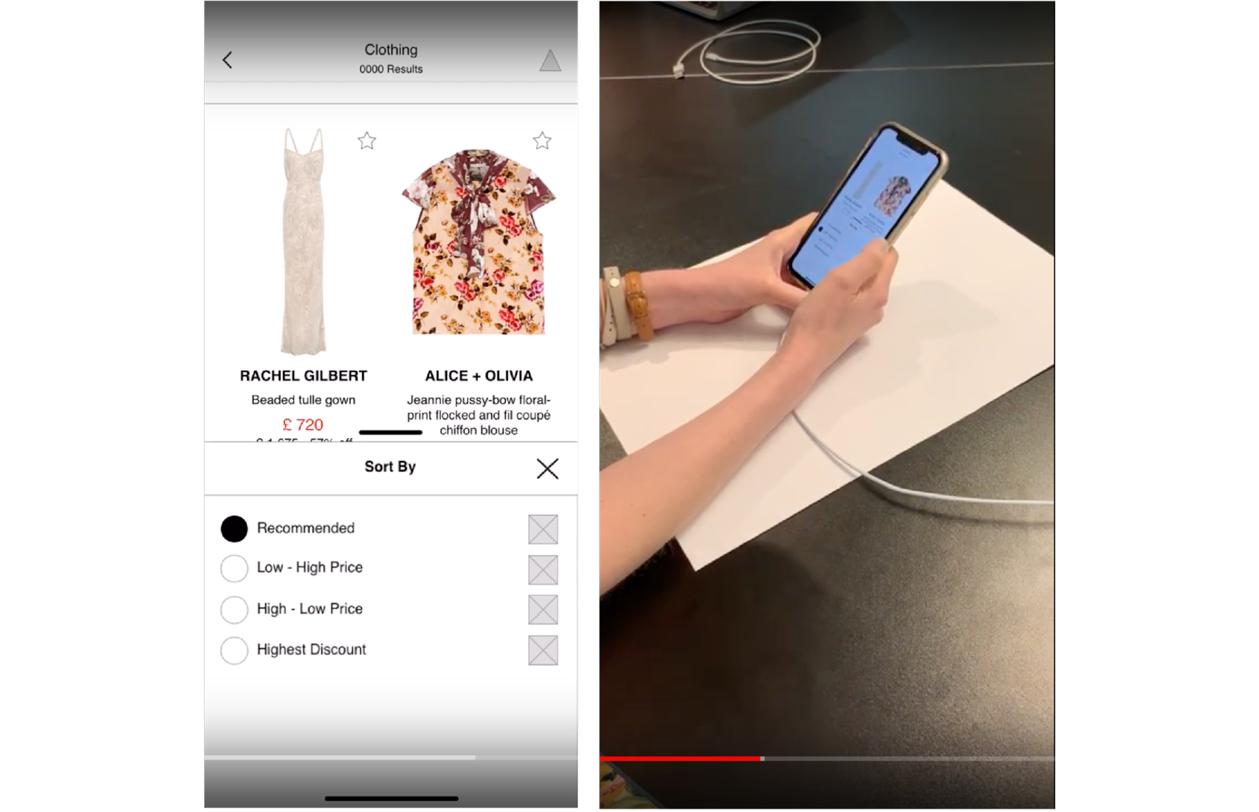
Structured sessions with the prototype before development, not after. Friction found early is exponentially cheaper to fix.
05 · Design Process
Navigation first. Everything else follows.
The audit made the priority clear: navigation restructuring would have the broadest impact across both personas. Once the structural foundation was right, PLP improvements, PDP changes, and Home screen refinements could build on it coherently.
Decision 01
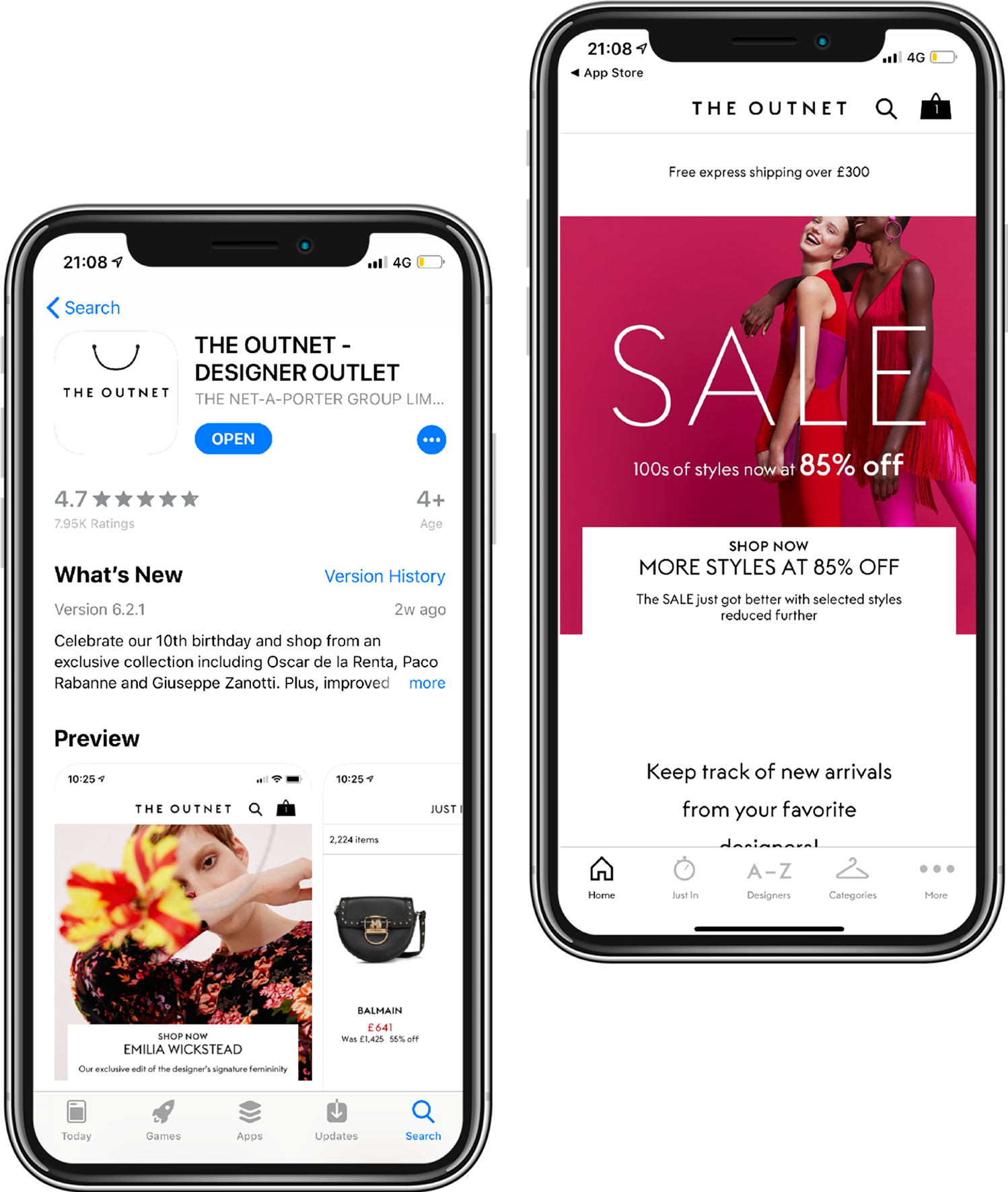
Consolidate Search, Categories, and Designers — move Bag and Wishlist to bottom nav
The restructured navigation put the highest-value actions within thumb reach and aligned iOS and Android for the first time. The A/B test results validated this: filter and sort engagement increased significantly once users could find them. The fix wasn’t making users want to filter — they always did. It was making filters findable.
Decision 02
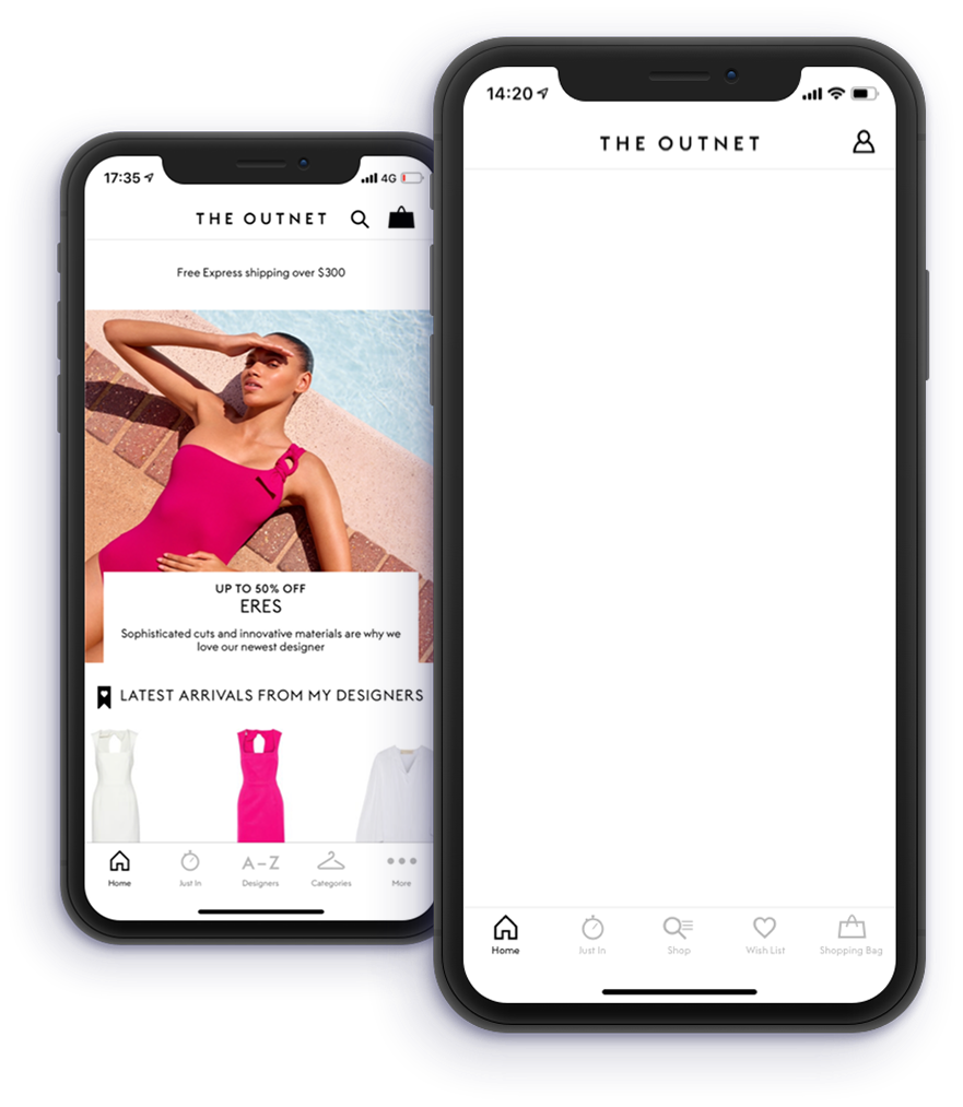
Sticky Add to Bag — shipped, tested, and honestly evaluated
The sticky Add to Bag was the intuitive solution to the scroll-past conversion problem — and it was the right hypothesis to test. The A/B result was instructive: no significant uplift in key metrics. Rather than rationalising this away, the team treated it as a signal that the PDP problem is more complex than placement alone. The next iteration will explore alternative triggers and contextual moments.
Decision 03
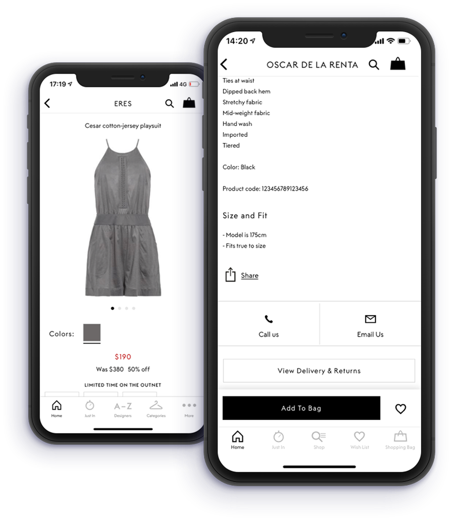
Making Sort and Filter sticky — elevating the PLP’s primary calls to action
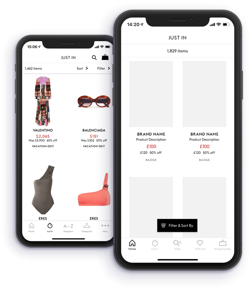
The Sort and Filter buttons are the primary calls to action on the PLP alongside clicking into a product — but their position at the top of the page made them difficult to reach, and their formatting caused them to get lost within the list. By relocating both buttons and making them sticky, we made these actions consistently accessible regardless of scroll depth. We also restyled them to align with the iconography language used across the Fashion Division, and introduced a subtle drop shadow to give the buttons a sense of elevation — a deliberate UI design choice that creates depth and signals interactivity without adding visual noise.
06 · A/B Test Results
Measured. Validated. Honest.
Firebase A/B tests validated the most impactful changes before full rollout — producing clear, measurable results for filter and sort improvements, and an honest signal that the PDP required deeper investigation rather than a quick fix.
Firebase A/B Test Results — PLP
+67%
Filter usage per unique session
Navigation restructuring made filters findable. Once users could access them, they used them — confirming the problem was discoverability, not motivation.
+104%
Sort usage per unique session
Sort usage more than doubled. For Style Strivers organising by price or newest, accessible sort functionality was a significant engagement unlock.
Firebase A/B Test Results — PDP Sticky Add to Bag
No sig. uplift
Add-to-bag rate on PDP
The honest result. No significant uplift in key metrics. The PDP conversion problem isn’t about CTA visibility — it’s about something earlier in the journey. A much richer brief for the next iteration.
Shipping a test that returns a null result is not a failure. It’s the most honest form of product design — it tells you something your assumptions couldn’t.
07 · Reflections
What I’d take forward
01
Audit-first is the right approach for legacy products
The UX Audit — 89 issues prioritised using Baymard’s severity and impact model — transformed a vague brief into a structured roadmap Engineering, QA, and Product could all work from. The investment in the audit paid back many times over in stakeholder alignment and sprint clarity.
02
The null result on sticky Add to Bag was the most valuable finding
It told us the PDP conversion problem isn’t about CTA visibility — it’s about confidence, intent, or information completeness earlier in the journey. That’s a much richer brief for the next iteration than “make the button more visible.”
03
Design system alignment is a product quality multiplier
Introducing shared components from the central design system had compounding effects. Every subsequent iOS release built on a stable, tested foundation — reducing design and engineering overhead on every update that followed.
Next // Selected Works
Bridging the eCommerce World
Get In Touch
Let’s build something great together.
Whether you’re looking for a Senior Product Designer for your next big project or want to talk through a challenge — I’m always happy to have a conversation.