Improving The App Experience
Context.
4 years since the latest update, the challenge was to improve and enhance the app experience for the Fashion Division with an allocated timeslot of 3 months, whilst taking into account, that Web introduced a new strategic head that allows enhanced experience. To ensure the Fashion Division creates an omnichannel experience, we introduced shared components through our Design System onto the app in order to enhance the experience.
Role
Leading the iOS Refresh alongside my Manager through the Discovery Phase until the monitoring.
Project Duration
3 Months of Research; 3 Months of Monitoring
Methods and Tools
User Research
UX Audit
Google Analytics
User Testing
Visual Design
Prototyping
Design challenge.
With a newly established Product Design Team, I was tasked to work alongside different fractions of the business to help pool information to help support the goal of the project.
Doing research will help to provide a better understanding of what we will need to tackle and how we can improve the user experience by aligning iOS and android together to have a seamless journey.
The process.
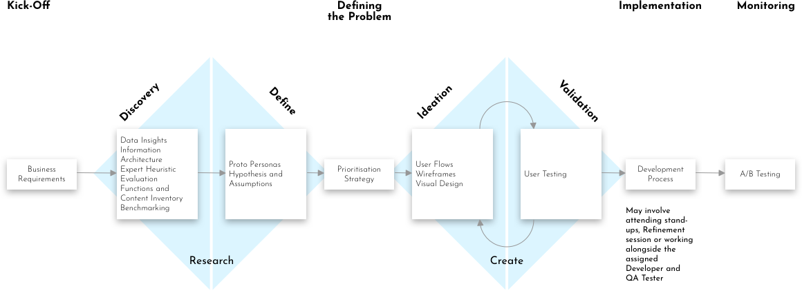
Our process in the Fashion Division is based on the Double Diamond theory alongside a Lean UX Process. With 4 main phases, we focused on are Discovery, Define, Ideation and Validation.
The research.
Finding the problems.
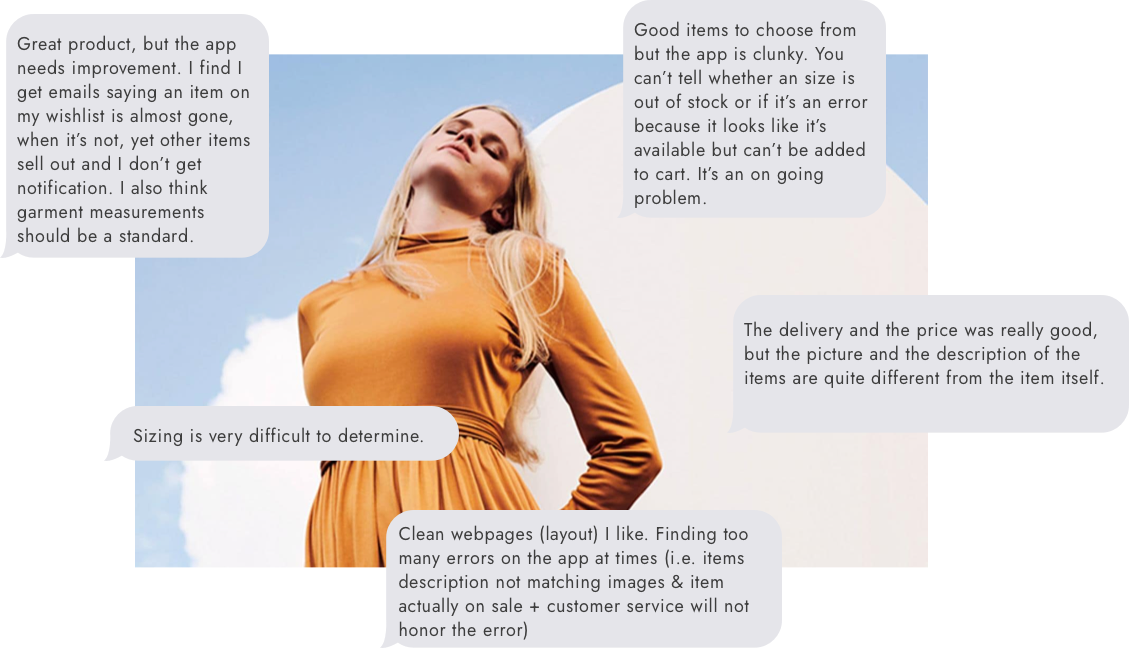
When tackling this task, I wanted to find out what Customer Insights received from the NPS. With the NPS, I found areas that helped me to understand what customers are saying, how they feel using the app, and what their concerns it.
Setting the foundations
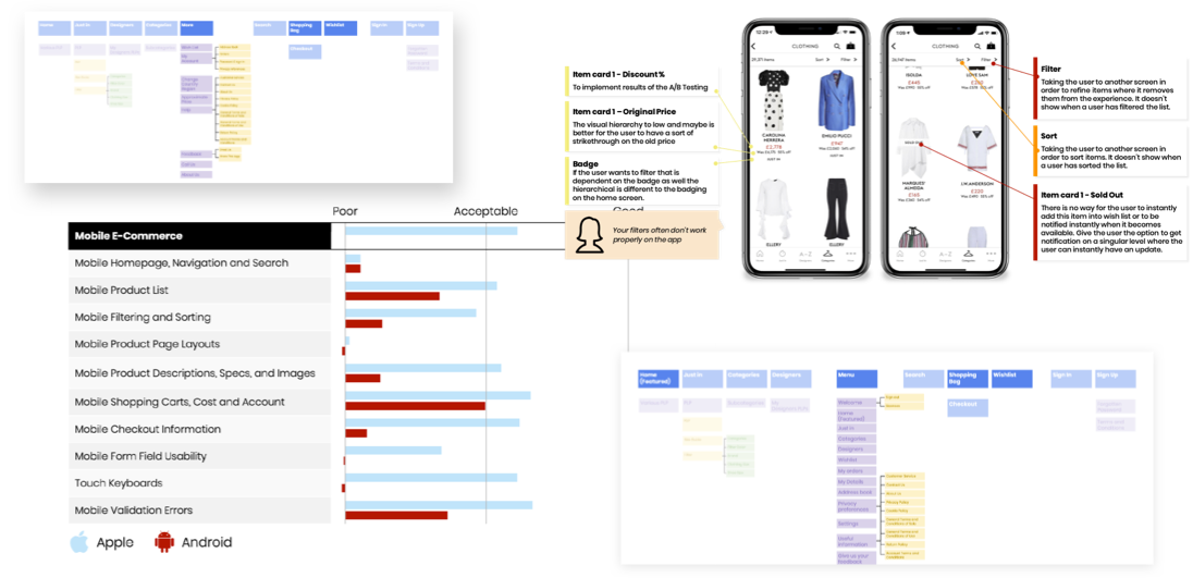
Working alongside the Analytics Team in Bologna and various teams, helped to identify the problem further. Here I gathered various insights through different tasks that will define the problem. Liaising with the UX Manager, we set a plan in motion by providing a UX Audit that details the data perspective through Analytics to conducting a Heuristic Evaluation.
It became clear that conducting UX Audit allowed us to see the data points, especially understanding how The OUTNET customers are trying to focus on items that they want to browse and add to the Wish List. Comparing the taxonomy and gathering analytics for both iOS and Android revealed the experiences are different.
The use of Baymard, allowed us to perform a Heuristic Evaluation that allowed us to compare the results for iOS and Android. Using 144 parameters, helped produce a comparison that will in turn give the foundation of a list of improvements.
Performing a Content and Functions Inventory, I was tasked to create an audit to list and semantically structure every template for the specific touchpoints. We listed the activities and categorized each point to help use the semantic structure. In each specific scenario, I rated the user’s needs whether it’s Good, Medium, Tricky, or Harmful.
Tailoring to our customers.
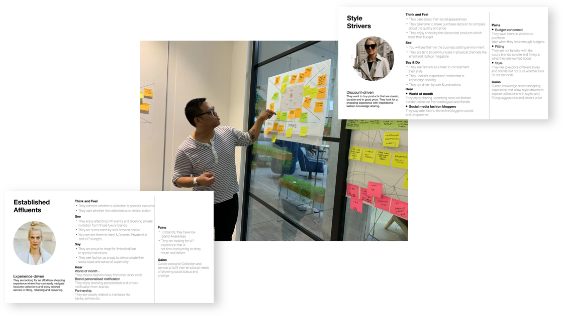
Gathering all the information and using the UX Audit allowed use to make use of the Marketing Insights Personas, where I performed a workshop that centers around Empathy Mapping with the Product Design Team to help get into the mindset of our customers.
Strategizing the problem.
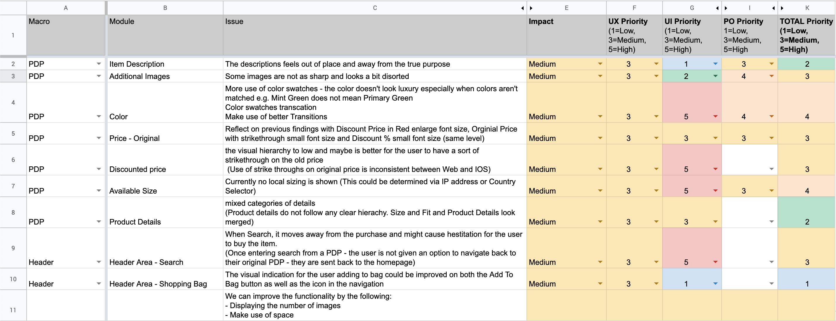
Using my own method of prioritization, helped to understand the severity score of usability based on the impact that I gathered from the Content and Functions Inventory Audit as well as inclusion from the Baymard Report.
With 89 issues identified, I presented these usability problems with the Product Owners alongside with Delivery Manager and his team of iOS Developers and QA Testers. This not only helped to prioritize usability issues in order of need but also helped to shape what we can deliver in the iOS Refresh.
The solution.
Based on what’s been prioritized, I worked towards addressing these usability issues but also bringing in new features that would be beneficial for the customer with potential solutions:
- Enhancing the experience on the Product Details Page
- Providing a new taxonomy that will help reduce duplication of templates
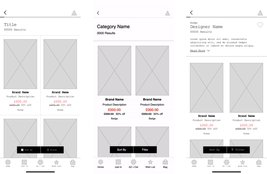
- Increase filtering on the product listing page
Wireframing and testing.
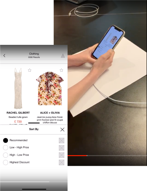
When validating designs, we assigned roles among the team. Doing internal user testing, we wanted to test out the functionality of the new features and whether this would solve the issues. To test out the new features, I created a prototype that focuses on the journey of the PLP to the PDP. Providing a script and tasks that will help flow out the design helped what I needed to produce on the prototype.
During the sessions, I observed how the participants were interacting with the prototype. The user testing revealed the following insights:
Unclear when you have sorted by a selection on the PLP what has been applied or if anything has been applied.
Users understood new functionality that star equals a wish list on PLP
Users would expect when they clicked on the star there would be an option to select a size and quick add to wish list
When a user selected a sort by list they expect to see an apply button the thick bar at the top of a size card – it isn’t clear what this represents
Unsure when selecting a filter if just the check box is clickable or the entire row
Users did not understand why they would want an update from low stock items
Putting Search front and center!
With the number of clicks, important areas like Search and Shopping Bag are not performing well through data and are unreachable for the user to easily access.
Consolidate Search, Categories, and Designers in order to increase product discoverability. Moving Wish List and My Bag to the bottom, to increase reachability and give the user a sense of priority when shopping. Centralizing on the Home Screen where My Account sits.
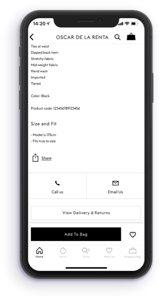
Making it more accessible.
When the user scrolls past the Add to Bag when attempting to find other product details, this is miss opportunity for the user to be converted, reducing the conversion rate.
Making it sticky, will increase its visibility and likely to create click and conversion rates. When the user becomes uninterested the Add to Page will disappear upon reaching YMAL to increase zoning and relevance.
Putting Search front and center!
Spacing is a key point, especially when it comes to bigger brands. With the frequent calls between Queue-It, I worked alongside the Harvey Nichols’ UI Designer. The UI Designer provided specifications to Queue-It to help build the template, this ensured our brand was in place.

Key Takeaways
During the time of development, the business and the Product Design Team aligned ourselves to do A/B Testing through Firebase. By strategizing what is needed first, we A/B tested the filters on PLP and the Sticky Add To Bag and Wish list on PDP for a week. The outcome of the results are:
Filters on the Product Listing Screen saw a high increase for both filter and sort by. Filters had a 67% increase in the use of filters for unique sessions whereas the sort by had a 104% increase in the use of sort by for unique sessions.
However, on the Product Details screen, the sticky element didn’t perform well due to no significant results on metrics observed. From our learnings, the takeaway from this is that the Product Design Team will revisit this particular area to enhance a better user experience on the PDP.
Want To Chat?
Let’s begin with a simple conversation whether it’s regarding a job, advice or a normal chitchat on UX.
I am happy to talk about my process and approach in the world of user experience.