Enhancing Your
Context.
First opened in 1996, the OXO Tower Restaurant was one of the first restaurants to be opened for Harvey Nichols.
The goal was to redesign and improve the user experience of the website, to make it modern and luxurious for the customer.
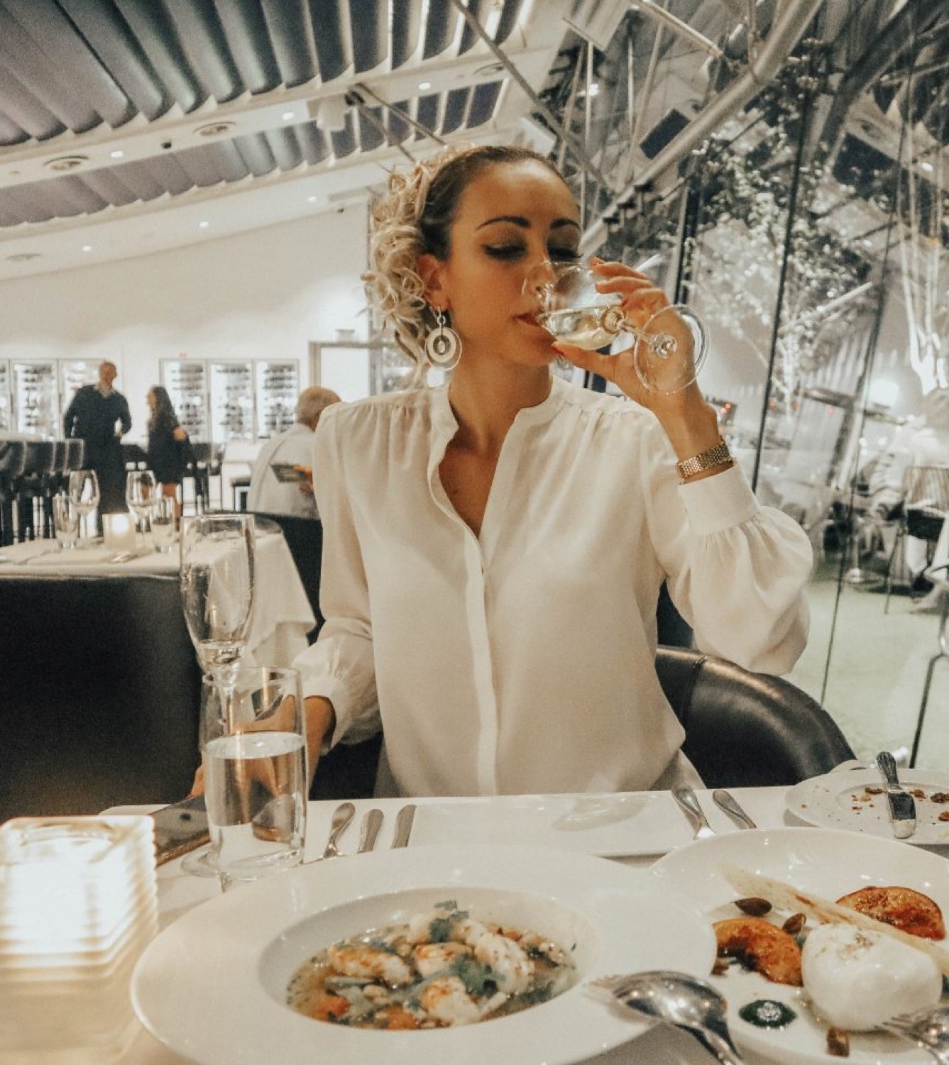
Modern choice with a garden terrace & panoramic skyline views serving globally influenced brasserie, the OXO Tower focuses on the fine dining experience. Situated on the top floor of the famous OXO Tower, this iconic building overlooks the Thames and has beautiful views of St Paul’s Cathedral. Offering a range of perfect occasions from coffee to an afternoon tea or an indulgent 6-course tasting menu with matched wines. The OXO Tower delivers the best to its customers.
Role
To improve the functionality that was previously available in pre-migration.
Project Duration
1 Week
Methods and Tools
User Flows
Wireframing
UX Design
Prototyping
Design challenge.
In 2018, General Manager, Nick Jarman, approached the team to update the experience that hasn’t been updated for 6 years. The goal is to make the OXO Restaurant and Brasserie more luxurious. The goal was to focus on the luxury experience but to make it an enjoyable experience that customers would crave for more information. Worked on this project for 3 months in 2018, this was a good time to enhance the experience further.
The process.
Worked a simple flow, that helped me to get insights on analytics as well as to understand what competitors were currently doing. Please note that during this period, the process had been cut short due to my availability on this project.

The research.
With inconsistent components used on the OXO Tower website, there was a lack of updating the website. Customers were having difficulty reading menus especially not finding the correct menu at the given time that they wanted to book. With over 6 years of using WordPress, this was a simply added theme to be used on a quick AdHoc basis. Problems occurred in the following areas:
- No unified design that is part of Harvey Nichols
- Navigation of finding menus was difficult to discover on Mobile
- Inconsistency between mobile and desktop functionality

Setting the foundations
With data available to me, I used GA and ContentSquare to get adequate information and produce recommendations that helped build a case for improvements to the OXO Tower. With the use of Benchmarking, it helped me to get industry standard information that was used to implement some features that would be beneficial for the customer. Using ContentSquare and GA, I conducted data analysis about the OXO Tower which helped me gather recommendations. What I gathered are the following areas:
The OXO Tower Homepage is the 12th most popular landing page on harveynichols.com. where the majority of customers would exit the website. Customers want to know more about What’s On.
Non-Bounce customers are spending more time browsing on the Home page than Bounce customers. Desktop is a different experience than mobile. Customers are more likely to spend and interact with the What’s On Page, bearing in mind previously customers are navigating towards the What’s On Pages.
Only 0.18% would click on the Telephone icon on Desktop, 0.38% Mobile. Social is low in Click Rate. Removing the social feeds for mobile will help improve finding specific information for the customers to find out more. 35% of customers would likely click on About on Desktop.
Customers are looking for more information on the Restaurant pages. 59% are likely to look at the menus.
Defining the Findings
Having gathered information both from the benchmarking and the data insight, I listed out the recommendations that will help benefit when designing my wireframes. The recommendations were as follows:
- Reduce the exit rate by at least half when the user is on the OXO Tower website
- Get users to find more information on the OXO Tower Home page
- Show the restaurants on the Main Home page
- To put What’s On at the bottom of the page on every template. Customers are likely to read and view more content on Desktop than on Mobile
- Make the homepage shorter and more precise in content whereby reducing the content for customers to read more
- In Order – Restaurants, Brasserie, Bar, What’s On, Gift Ideas, Private Hire, Book a Table
- Have a physical footer to consist of FAQs, HN.com, Careers, Contact Us
- OXO email address to be implemented as a form. This will reduce the number of native emails to be opened whereby having a contact form will keep the customers on the website
- Having the Menu on the same page will help improve the content on the individual pages
- Making Book a Table more prominent will help improve the bookings for mobile

The solution.
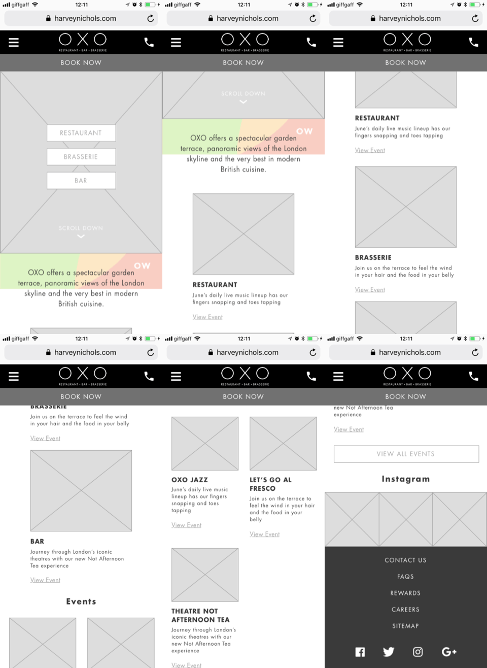
After consolidating my findings, I presented the improvements to the SEO associate in the OXO Tower and the General Manager along with the Product Manage. Through a series of meetings, I produced Wireframes to focus on the areas that I want to improve.

Booking your needs.
Customers are more likely to book and look at special events happening in the OXO Tower. Having a carousel to showcase events allows customers to discover more as well promoting the Book Now CTA provides easy access to instantly book.
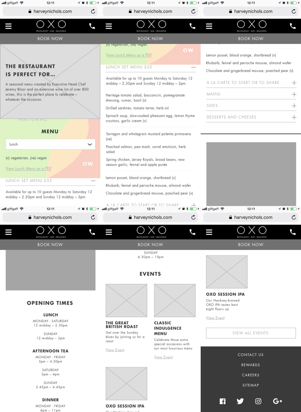
Making Menu the main priority.
Based on previous systems, menus were used as a PDF version. Bringing the menu out allows for better SEO, better categories via accordions, and ease of use.

Key Takeaways
During this time, I handed over the wireframes to the UI Designer and the Product Manager. With a detailed handover, I wanted to ensure that my findings were reflected as well as to assess that my limited time with this project was soon to be on a halt. Looking back, I would work closely with the developers as well as working with creative to get better imagery.
Want To Chat?
Let’s begin with a simple conversation whether it’s regarding a job, advice or a normal chitchat on UX.
I am happy to talk about my process and approach in the world of user experience.